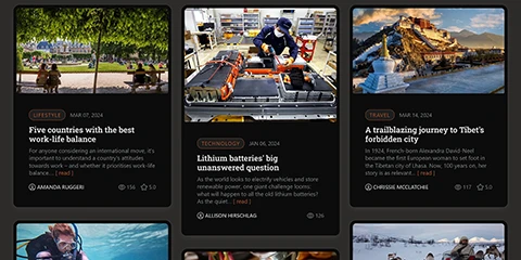
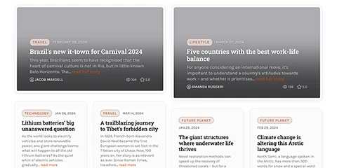
We designed a bright and attention-grabbing layout that will definitely attract your site visitors. You can use this "Pinterest-like" layout for a portfolio, photography or artist galleries, catalog of company products, or just for news blocks, etc.
Rational Layout Screenshots
Designed for multi-purpose visually appealing websites
Highly customizable and fully responsive Masonry grid layout.
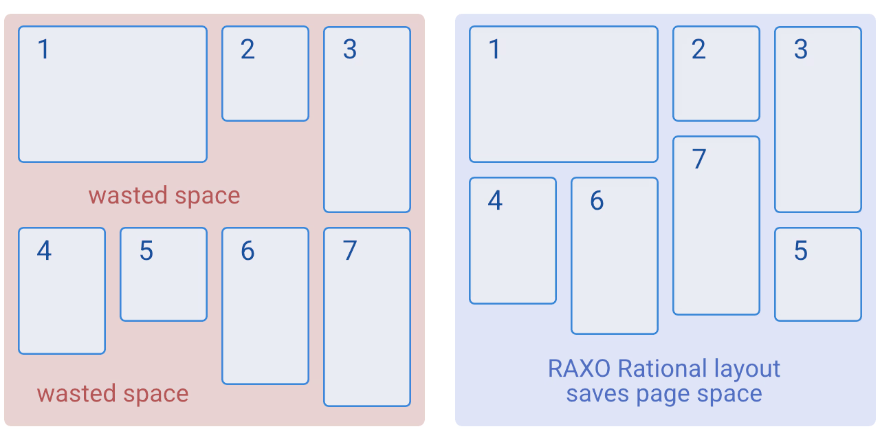
When it comes to front-end development, the masonry layout has proven to be an effective way of displaying multiple elements in a grid, partially saving page space.
A masonry layout is one in which elements are arranged in a row, one after the other. As they move to the next row, the elements move up into any gaps left by shorter elements in the first row. This layout has been widely shared and popularised on platforms such as Pinterest.
Think of it as the flip side of CSS floats. Whereas floating arranges elements horizontally then vertically, Masonry arranges elements vertically then horizontally according to a grid. The result minimizes vertical gaps between elements of varying height, just like a mason fitting stones in a wall.
Take a look at this visual explanation. Note the numbers, which show the actual order of the elements in your HTML code:

Rational Layout Features
- Bright and attention-grabbing design
- Ready-to-use layout, no CSS or coding skills required;
- Easy installation via Joomla installation interface;
- Predefined number of columns for each device and screen size;
- Number of columns easily switchable (from 1 to 6) to suit your needs;
- Flexible structure and design supports any set of content elements: image, title, author, date, read more, etc;
- Supports the Dark & Light theme to enhance the audience's reading experience;
- 10 color schemes for you to easily switch between.


